In this lesson, we are going to go over color: which colors go well with one another, how to repeat colors in a landscape to balance and look harmonious and how to place flowering plants strategically so you get the best use of color over the different seasons.
First we will start with the color wheel to determine which colors go well together. For many people, picking the correct colors comes naturally. When they look at the color wheel, it just confirms what they already think looks good. The added challenge with plants is the color and texture of the foliage (as we had discussed in the last lesson). It is a good idea when putting together a landscape design or even something as simple as a container, to bring the plants together physically or at least have pictures of them to look at and see how the overall plants (flowers and foliage) look together. Sometimes they look great and sometimes they are just off.
To give you a little knowledge of color, let’s go over some basics. The first thing we are going to do is define some words. You will have heard many of these words thrown around in articles and on HGTV shows on interior design and may not have a correct definition of them.
- Warm colors: Red, Yellow and Orange are the warm colors. These are vivid and bold in nature. They tend to come closer to you and catch your eye.
- Cool colors: Blue, Purple and Greens are cool colors. They are calm and soothing and tend to recede in space making that space look larger.
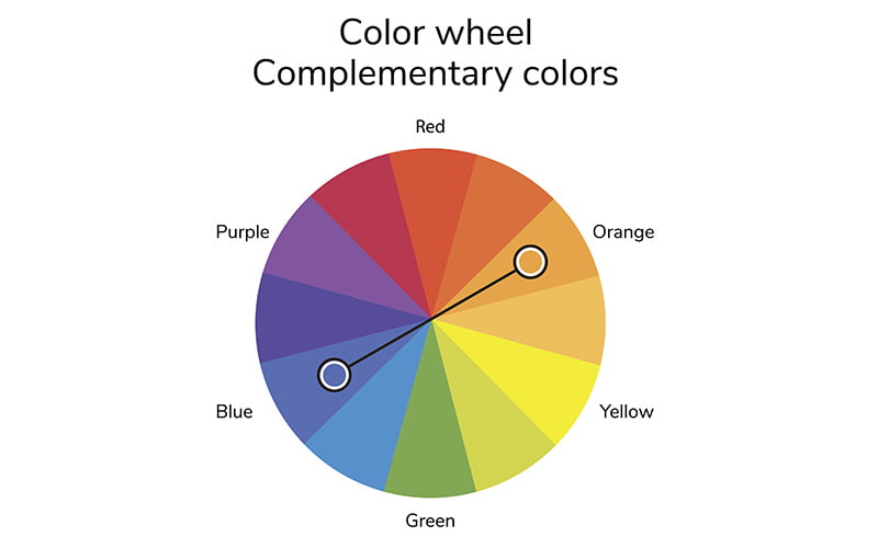
- Complementary Colors: These are the colors that are opposite to each other on the color wheel. For example: yellow and purple, blue and orange and red and green. An interesting thing you will note is that a pair of complementary colors is made up of one cool color and one warm color. Orange, reds, and yellows are the warm colors, while blues, greens, and purples are the cool colors. Complimentary colors work together by bringing out the intensity of each other. They provide the highest contrasts available on the color wheel.
- Contrast: a difference between two or more things that you can see clearly when they are compared or put close together. The contrasts in the design creates interest. Using complimentary colors will create contrast. Also using different types of texture- shiny green against blue fern-like foliage. Also dark green foliage paired with a light colored flower. These are all examples of contrast.
- Analogous Colors: These are the colors next to each other on the color wheel. For example: Red, orange and yellow or violet, red-violet and red are examples of analogous colors. They are gradations of the same color.
- Tints: tints are mixtures of pure colors with white. Pink would be a tint of red mixed with white. Light blue would be a tint of blue mixed with white.
Now that we have defined these words, now what? Let’s keep this simple and put in a few principles that you can follow easily in your search for color. If you have a small space you may want to have cool colors (blues, purples and greens) as your background. If you want to have something pop out from that landscape, use a complimentary color to your cool colors. For example if you have light blue hydrangeas and green Leyland Cypress in the background, you might want to add a red/orange to compliment the blue/green. However since the blue is a light blue (tint), you may want to lighten your orange/red to a salmon/pink (tint). Make sense?
Now what if your yard is large and you want it to visually look closer, you could add warm colors such as red rhododendrons, orange azaleas, yellow daffodils followed by Rudbeckia ‘Goldstrum’.
We hope this helps give you a little structure to your color choices. Try to plan what colors you want to work with before you see all the flowers displayed. Then you are making planned decisions that will enhance your design.
How to repeat colors for a comprehensive design
When you are putting your design together, it is good to pull it all together with some repeating patterns of color. When everything is all jumbled together with many different flowering plants, it gives a chaotic feeling. However, if you repeat, for example, the same flowering shrub two or three times throughout the bed, it will give it a more pleasing look.
The repetition of color can also be done with foliage color such as burgundy foliage or a variegated green and white foliage. If you are going to repeat, for example a blue color, it could be different plants altogether such as Dwarf Hydrangea and Agastache ‘Blue Fortune’. They are very similar in color and height and would give the effect of a repeating pattern of color. It is pleasing to the eye to have order in the garden. Another important point is that repeating a pattern will make your design process much easier. You should have a sense of balance among the colors and textures. There should be a harmony- something to be able to sit back and just look at. After all, when we design our garden, who is going to be the audience? More than likely it will be you!
Here are some examples of balance and color repetition:

KEY: Hyd = Hydrangea Mac. ‘Mathilda Gutges’ Ag = Agastache ‘Little Adder” Gold Mop = Chamaecyparis pis. fil. ‘Aurea Mop’ Cor = Coreopsis V. ‘Zagreb’ Ech = Echinacea purpurea ‘Magnus’
Timing of Bloom
When we first started this course, we told you that Landscape Design is a complex subject, consisting of many different and connected parts. This is the one part that challenges even professional landscape designers: coordinating the blooming times of the plants in the landscape. It would be so easy if all plants bloomed all the time, then we would just have to worry about the coordinating of colors. Alas, that is not the case. If you love purple lilacs and Peegee Hydrangeas, unfortunately, you will never see them in bloom together. So knowing the season of bloom is essential when planning.
So, how can you take advantage of this timing?
Here is a scenario: You have a border bed along the backside of your property. You don’t want the maintenance of perennials or other flowers but you do want some color to look at through the window. This is a time you could take advantage of the different blooming periods by putting a progression of low-maintenance flowering shrubs in this bed. Starting with Hamamelis virginiana (Witchhazel) which blooms as early as January through early March, followed by Forsythia in early April, next comes Common Lilac and many varieties of Viburnum in May, Spirea blooms June and July, Hydrangeas start blooming at the end of June, followed by Peegee Hydrangeas and Rose of Sharon blooming at the mid to late Summer into the Fall. You have your entire growing season covered in this way.
If you have a smaller yard, you can just have this same progression of bloom with only one of each of these shrubs in strategic spots in the yard. So, for the entire Spring, Summer and Fall seasons, something in your yard is in bloom.


As a note, you can’t always go by the timing of plants blooming in the Garden Center. Often shrubs are coming in from warmer climates such as the South or West Coast and will be ahead of us (hello Hydrangeas and Roses blooming in May!). You can check the tags or ask someone to make sure you know when it will bloom once planted.
We hope this gives you a little guidance on color in the garden. As with all rules such as the color wheel, you can always break them but you have the knowledge now and you can make better decisions as to creating pops of color in a container or garden. This is something to have fun with. When all else fails, gather the plants up and put them together and see how they look. It is your viewpoint that matters in the end, so have fun!!